Ta strona korzysta z ciasteczek, aby zapewnić Ci najlepszą możliwą obsługę. Informacje o ciasteczkach są przechowywane w przeglądarce i wykonują funkcje takie jak rozpoznawanie Cię po powrocie na naszą stronę internetową i pomaganie naszemu zespołowi w zrozumieniu, które sekcje witryny są dla Ciebie najbardziej interesujące i przydatne.
Kolory
Kolory
Wprowadzenie
Kolory mają określone temperatury i oddziałują na Twój organizm i samopoczucie. Kolory ciepłe o intensywnej barwie: żółcie, czerwienie, pomarańcze oraz częściowo żółte zielenie i czerwone fiolety działają pobudzająco na zmysły, przyśpieszają krążenie krwi, podnoszą temperaturę ciała. Z kolei kolory chłodne: zielenie, błękity oraz niebieskie fiolety łagodzą nastrój, wprowadzając element wyciszenia. Z neutralne natomiast uważane są szarości, biele i czernie – nie pobudzają, ale ze względu na brak bodźca działają uspokajająco. Intensywne ciepłe kolory z domieszką bieli, czerni czy szarości stopniowo tracą swoje energetyzujące działanie. Brązy, beże, róże nie będą działały pobudzająco w takim samym stopniu jak np. intensywny czerwony, choć wciąż pozostają kolorami ciepłymi i przytulnymi. Dowiedz się więcej, o tym jak kolory działają na Ciebie!
BIAŁY- ochrona, czystość, niewinność
Jak działa?
Biały do kolor neutralny, pełni funkcję ochronną, gdyż odbija złą energię, wzmacnia intuicję, uspokaja. Działa na poprawę samopoczucia, dodaje optymizmu, zapewnia równowagę, sprzyja odprężeniu.
Biel nie występuje w czystej postaci w przyrodzie, zawsze ma dodatek innej barwy. W zależności od temperatury tej barwy, biel może być bardziej „ciepła” lub „chłodniejsza”.
Gdzie stosować?
Biel jest ponadczasowa i bardzo chętnie wykorzystywana w pomieszczeniach, zwłaszcza jako tło. Świetnie sprawdzi się w kuchni czy łazience, nadając im wrażenie czystości, ale także w tych pomieszczeniach, w których zależy nam na wrażeniu przestrzeni, jasności. Biel jest także zalecana do pomieszczeń, które mają oddziaływać neutralnie. Zbyt dużo bieli może jednak powodować, że wnętrze wyda się zimne, sterylne, szpitalne.
Jak łączy się z innymi kolorami?
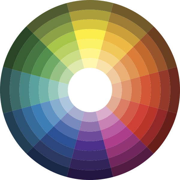
Biały z kolorami dopełniającymi się:
(biały i kolory położone naprzeciwko na kole barw)
Biały z kolorami analogicznymi:
(biały i kolory sąsiadujące na kole barw)
Biały z kolorami monochromatycznymi:
(biały i odcienie tego samego koloru)
Biały z szarym i czarnym (achromatyczne):
Z czym się kojarzy?
Biel jest kojarzona z prostotą, prawdą, czystością intencji. Biała flaga oznacza poddanie się. Biały to także kolor kościoła i wiary (ze względu na białe szaty Jezusa i apostołów).
Co symbolizuje?
Biel to przede wszystkim symbol czystości, niewinności, pokoju. To także kolor prawdomówności, dobra i jasności. Symbolizuje również aniołów, apostołów i odnowę życia duchowego.
CZARNY – elegancja, tajemniczość, mrok
Jak działa?
Czarny wycisza, uspakaja, działa wspierająco i ochronnie. Jednakże stosowany w nadmiarze ma działanie przygnębiające i izolujące.
Gdzie stosować?
Czerń należy stosować z ostrożnością i rozwagą. Nie jest wskazana w zbyt dużej ilości, dobrze sprawdza się natomiast jako dopełnienie czy akcent. Nie należy korzystać z czerni w pokoju dziecięcym czy dziennym, bo może je przytłoczyć.
Jak łączy się z innymi kolorami?
Czarny z kolorami dopełniającymi się:
(czarny i kolory położone naprzeciwko na kole barw)
Czarny z kolorami analogicznymi:
(czarny i kolory sąsiadujące na kole barw)
Czarny z kolorami monochromatycznymi:
(czarny i odcienie tego samego koloru)
Czarny z szarym i białym (achromatyczne):
Z czym się kojarzy?
Jest kolorem pełnym sprzeczności. Z jednej strony kolor czarny to synonim elegancji (wieczorowe garnitury, fraki, smokingi, czarne suknie). Podkreśla autorytet i kompetencję. Ale z drugiej kojarzy się także z religią, żałobą i śmiercią. Czerń jest kolorem tajemnicy i sekretów. W przyrodzie występuje dość rzadko za dnia, jest natomiast królową nocy.
Co symbolizuje?
Kolor czarny symbolizuje elegancję, luksus, władzę, ale także mrok, zło, śmierć i strach.
SZARY – ochrona, neutralność, bezpieczeństwo
Jak działa?
Kolor szary nie oddziałuje w intensywny sposób, jest neutralny i z tego powodu tworzy barierę ochronną przed otoczeniem, pomagając oczyścić umysł. Odpręża, uspokaja, działa wyciszająco. W nadmiarze może powodować izolację i smutek, uszczuplać zapasy energii. Ciemne odcienie szarego działają wręcz przygnębiająco.
Gdzie stosować?
Szary należy stosować do pomieszczeń, które mają być neutralne (gabinety lekarskie, biura do wynajęcia, korytarze galerii). Aktualnie szarości są bardzo popularne i znajdują zastosowanie praktycznie we wszystkich pomieszczeniach. Zwłaszcza często wykorzystywane są w pokoju dziennym. Kolor szary warto jednak łączyć z innymi w pomieszczeniach, gdyż zbyt wiele szarości może dać ponury efekt.
Jak łączy się z innymi kolorami?
Szary z kolorami dopełniającymi się:
(szary i kolory położone naprzeciwko na kole barw)
Szary z kolorami analogicznymi:
(szary i kolory sąsiadujące na kole barw)
Szary z kolorami monochromatycznymi:
(szary i odcienie tego samego koloru)
Szary z czarnym i białym (achromatyczne):
Z czym się kojarzy?
Szary to kolor bezpieczeństwa, ochrony. Potocznie szarość oznacza brak koloru. Nic więc dziwnego, że szary kojarzy się czasem z nudą czy codziennością (szary, zwykły dzień).
Co symbolizuje?
Podobnie jak czarny, kolor szary symbolizuje tajemnicę oraz skrywane uczucia.
BEŻOWY – spokój, bezpieczeństwo, ciepło
Jak działa?
Beże to ciepłe, delikatne kolory, które wyciszają i wprawiają w pogodny nastrój. Beżowy nie drażni, nie zwraca uwagi, jest bezpieczny. Kolor ten wprowadzaja do wnętrza harmonię oraz buduje wrażenie przytulności.
Gdzie stosować?
Beże sprawdzą się w pokoju do pracy, w jadalni, a także w pokoju dziecięcym. Warto je stosować w pomieszczeniach o niewielkim nasłonecznieniu. Nadmiar beżu może jednak spowodować, że wnętrze stanie się nijakie, pozbawione wyrazu.
Jak łączy się z innymi kolorami?
Beżowy z kolorami dopełniającymi się:
(beżowy i kolory położone naprzeciw siebie na kole barw)
Beżowy z kolorami analogicznymi:
(beżowy i kolory sąsiadujące na palecie barw)
Beżowy z kolorami monochromatycznymi:
(beżowy i odcienie tego samego koloru)
Beżowy zestawienie monochromatyczne:
(odcienie beżu)
Z czym się kojarzy?
Beże do kolory natury – piasków, ściółki leśnej, suchych traw oraz naturalnych tkanin przed farbowaniem: lnu i jedwabiu; naturalnych skór i drewna. Kojarzą się z wypoczynkiem, wakacjami na łonie natury – drewnianymi chatami, domkami, plażą, spacerami w lesie. Często nazwy tych kolorów nawiązują do słodkich przyjemności: biszkoptowy, kawa z mlekiem, toffi, karmelowy. Z drugiej strony są to również kolory kojarzące się z nijakimi korytarzami instytucji takich jak szkoła czy urząd.
Co symbolizuje?
Beż nie ma silnych odniesień symbolicznych.
BRĄZOWY – stabilizacja, odprężenie, użyteczność
Jak działa?
Kolor brązowy daje stabilizację oraz poczucie bezpieczeństwa. Brązy odprężają i wprowadzają do wnętrza harmonię. Kolor ten wspomaga koncentrację uwagi i zdobywanie wiedzy.
Gdzie stosować?
We wnętrzach klasycznych kolor brązowy jest wszechobecny: stosowany w kuchni, salonie, przedpokoju, w różnym natężeniu także w pokojach młodzieżowych i dziecięcych. Jako kolor odprężenia sprawdzi się zwłaszcza w pokojach przeznaczonych do wypoczynku. Jest świetny do gabinetów.
Jak łączy się z innymi kolorami?
Kolory dopełniające:
(kolory położone naprzeciwko siebie na kole barw)
Kolory analogiczne:
(kolory sąsiadujące ze sobą na kole barw)
Kolory monochromatycze:
(odcienie tego samego koloru)
Z czym się kojarzy?
Brąz to kolor ludzi pracy i tradycji, a także rzemieślników. Kojarzy się z solidnością i oparciem. Jest praktyczny, sumienny, konkretny, w ciemnych odcieniach – elegancki. Brązy to także kolory natury: ciemnego drewna i kory.
Co symbolizuje?
Kolor brązowy symbolizuje naturę, ale w jesiennej, stonowanej odsłonie. Jego domeną jest spokój, powaga, ciepło oraz użyteczność.
CZERWONY– energia, miłość, życie
Jak działa?
Najintensywniejsza i najcieplejsza ze wszystkich barw. Działa pobudzająco, energetycznie, witalizuje, rozgrzewa zmysły, wyostrza uwagę. Pobudza apetyt, a także poprawia humor. Czerwony od zawsze wzywa do działania. Bardzo skupia ludzką uwagę. Wyzwala adrenalinę i podnosi ciśnienie krwi. Stosowany w nadmiarze, po jakimś czasie może powodować zmęczenie czy wręcz agresję.
Gdzie stosować?
Kolor czerwony można stosować w jadalni lub kuchni, jeśli chcemy wzmóc apetyt. Jako barwa miłości sprawdzi się także w sypialni. Trzeba jednak pamiętać, aby kolor wykorzystywany w tym miejscu nie był zbyt intensywny, bo może utrudniać zasypianie – szczególnie osobom z natury pobudliwym i nerwowym. Należy unikać stosowania czerwieni w pokoju dziecięcym, chyba że w formie dodatków. Nie jest to także dobry kolor do wnętrz, gdzie ma odbywać się nauka. Czerwony najlepiej sprawdza się w dużych pomieszczeniach.
Jak łączy się z innymi kolorami?
Kolory dopełniające:
(kolory położone naprzeciwko siebie na kole barw)
Kolory analogiczne:
(kolory sąsiadujące ze sobą na kole barw)
Kolory monochromatycze:
(odcienie tego samego koloru)
Z czym się kojarzy?
Kolor czerwony kojarzony jest z aktywnością, działaniem, namiętnością, ale także jako kolor krwi – z życiem. Jest kolorem wskazującym na pobudzenie (czerwień warg, rumieńce). Ma również negatywne konotacje: kojarzy się z grzechem czy komunizmem. Czerwony to kolor władzy.
Co symbolizuje?
Jasna czerwień symbolizuje miłość, radość, piękno i witalność. Ciemna czerwień (burgund) to z kolei kolor gniewu, siły i rewolucji.
ZIELONY - odpoczynek, harmonia, natura
Jak działa?
Zielony to kolor relaksu; rozluźnia, łagodzi napięcia, wprowadza harmonię, pozwala utrzymać w równowadze energię psychiczną i fizyczną. W nadmiarze może jednak powodować znudzenie i bierność. Ponieważ jest to kolor świeżych warzyw zaostrza apetyt.
Uwaga: Kolor zielony powstaje z połączenia koloru żółtego i niebieskiego, a więc kolorów o odmiennym sposobie oddziaływania: niebieski wycisza, żółty – dodaje energii. Stąd kolor żółto-zielony łagodnie pobudza.
Gdzie stosować?
Stonowany odcień zieleni dobrze sprawdzi się w sypialni, salonie, gabinecie, a jaśniejszy w pokoju dziecięcym, zwłaszcza dla starszych dzieci.
Jak łączy się z innymi kolorami?
Kolory dopełniające:
(kolory położone naprzeciwko siebie na kole barw)
Kolory analogiczne:
(kolory sąsiadujące ze sobą na kole barw)
Kolory monochromatycze:
(odcienie tego samego koloru)
Z czym się kojarzy?
Zielony to kolor ziemi i ciepłych pór roku. W zależności od odcienia kojarzy się bądź ze świeżością, witalnością, wiosną (miętowy, groszkowy) lub wyciszeniem, harmonią (oliwka, butelkowa zieleń). Zielony kojarzy się także z dobrym losem (czterolistna koniczynka) oraz bogactwem (zielone dolary). Jednakże ciemne, zbrudzone zielenie to kolory rozkładu, gnicia.
Co symbolizuje?
Zieleń to symbol młodości, szczęścia, nadziei i powodzenia, a także wolności.
NIEBIESKI – świeżość, odprężenie, przestrzeń
Jak działa?
Niebieski to kolor chłodny, świeży, uspokajający i relaksujący zarazem. Łagodzi napięcia, pomaga zasnąć przemęczonym i zdenerwowanym, odpręża. Daje poczucie zadowolenia i wewnętrznej harmonii. Poprawia koncentrację i ułatwia przyswajanie wiedzy, wspomaga kreatywność. Obniża ciśnienie krwi i apetyt. Zastosowany w nadmiarze może stworzyć wrażenie chłodu.
Gdzie stosować?
Idealnie sprawdza się w pomieszczeniach przeznaczonych do odpoczynku np. sypialni (błękit, indygo) oraz w pokojach do pracy. Jednocześnie ze względu na fakt, że kojarzy się z czystością, higieną błękit chętnie jest wykorzystywany w kuchni czy łazience. Niebieski jest też dobrym kolorem do pokoju dziecięcego, przygotowanego dla starszych dzieci (od ok. 12. roku życia), gdyż wzmacnia ich umiejętności abstrakcyjnego myślenia.
Jak łączy się z innymi kolorami?
Kolory dopełniające:
(kolory położone naprzeciwko siebie na kole barw)
Kolory analogiczne:
(kolory sąsiadujące ze sobą na kole barw)
Kolory monochromatycze:
(odcienie tego samego koloru)
Z czym się kojarzy?
Jasny błękit kojarzy się wodą, niebem, świeżością, chłodem i uduchowieniem. Błękit zawiera w sobie element boski i sprzyja „bujaniu w obłokach”. Z kolei domeną ciemnych błękitów (granatu) jest porządek, hierarchia, dyscyplina. Granat to kolor munduru, mundurków szkolnych, klasycznych urzędniczych garniturów.
Co symbolizuje?
Niebieski symbolizuje bezpieczeństwo, zaufanie oraz spokój, ale też inteligencję i technologię.
ŻÓŁTY – radość, ciepło, mądrość
Jak działa?
Kolor żywy, radosny, pozytywny, dobry na smutek i depresję, bo poprawia humor, inspiruje, skłania do umysł do działania. Żółty poprawia pamięć, dodaje energii, nadaje pewności siebie, sprzyja podejmowaniu decyzji. Zapewnia dobry nastrój i optymizm, ułatwia nawiązywanie kontaktów. Ten kolor pobudza apetyt i skutecznie przykuwa uwagę. Podobnie jak inne barwy ciepłe przyśpiesza krążenie i podnosi temperaturę ciała.
Gdzie stosować?
Żółty to świetny kolor do miejsc pracy: biura, gabinetu, sali wykładowej czy pokoju młodego ucznia. Sprawdzi się także w pokoju dziennym lub kuchni. Ociepla i powiększa optycznie pomieszczenia.
Jak łączy się z innymi kolorami?
Kolory dopełniające:
(kolory położone naprzeciwko siebie na kole barw)
Kolory analogiczne:
(kolory sąsiadujące ze sobą na kole barw)
Kolory monochromatycze:
(odcienie tego samego koloru)
Z czym się kojarzy?
Żółty przede wszystkim kojarzy się słońcem, latem, ale także dziećmi i zabawą. Jako kolor lata przypomina o wypoczynku i rozrywce. Ponieważ kolor żółty przyciąga uwagę, używany jest również jako ostrzeżenie.
Co symbolizuje?
Żółty symbolizuje z jednej strony szczęście, z drugiej zaś – wiedzę, mądrość, rozsądek i uporządkowanie. Żółty to także kolor zdrady i wrażliwości.
POMARAŃCZOWY – optymizm, kreatywność, młodość
Jak działa?
Pomarańczowy to kolor ciepły, który przywraca radość, dodaje otuchy, podnosi poczucie własnej wartości, poprawia nastrój, sprzyja pogodnym myślom. Pomarańcz zwiększa motywację do działania, pomaga kreatywnie myśleć. Działa silnie energetyzująco, choć nie tak intensywnie jak czerwień. Podobnie jak inne barwy ciepłe przyśpiesza krążenie i podnosi temperaturę ciała. W zbyt dużej ilości może powodować zmęczenie.
Gdzie stosować?
Pomarańczowy należy stosować wszędzie tam, gdzie spotykają się ludzie. Dlatego świetnie się nada do pokoju rodzinnego. Sprawdzi się również w gabinecie. Pomarańczowy to barwa odważna i intensywna, więc dobrze stosować ją w dodatkach, także w pokoju dziecięcym. Ten kolor poprawia apetyt, co sprawia, że jest też dobry do kuchni czy jadalni.
Jak łączy się z innymi kolorami?
Kolory dopełniające:
(kolory położone naprzeciwko siebie na kole barw)
Kolory analogiczne:
(kolory sąsiadujące ze sobą na kole barw)
Kolory monochromatycze:
(odcienie tego samego koloru)
Z czym się kojarzy?
Pomarańczowy to kolor młodości, aktywności i kreatywności. Zazwyczaj przywodzi na myśl kolorowe ptaki, kwiaty, motyle. W takim soczystym wydaniu jest najradośniejszą z barw. Ale pomarańczowy to także kolor jesieni i święta Halloween oraz ratownictwa. Gdy kolor ten zbliża się do brązu wskazuje na przemijanie.
Co symbolizuje?
Pomarańczowy symbolizuje zabawę, entuzjazm, optymizm, ale też siłę i przedsiębiorczość.
FIOLETOWY – spokój, relaks, koncentracja
Jak działa?
Kolor filetowy pomaga łagodzi objawy stresu, działa wyciszająco. Sprzyja medytacji i pracy twórczej. Świetnie sprawdza się także po wysiłku umysłowym, ponieważ poprawia koncentrację.
Uwaga:
Kolor fioletowy powstaje z połączenia czerwonego i niebieskiego. To dwa kolory o odmiennym działaniu – niebieski wycisza, a czerwony energetyzuje. Dlatego w zależności od proporcji tych kolorów fiolet będzie działał bardziej lub mniej łagodząco.
Czerwono-fioletowy (filet przechodzący w purpurę) będzie działał pobudzająco; niebiesko-fioletowy (przechodzący w indygo) – łagodząco i wyciszająco.
Gdzie stosować?
Zalecany jest do pokoju dzieci, gdyż rozwija zdolności kreatywne. Jasne fiolety mogą być także stosowane w sypialni. Kolor niebiesko-fioletowy sprawdzi się we wnętrzach odświętnych i reprezentacyjnych, urządzonych z rozmachem.
Jak łączy się z innymi kolorami?
Kolory dopełniające:
(kolory położone naprzeciwko siebie na kole barw)
Kolory analogiczne:
(kolory sąsiadujące ze sobą na kole barw)
Kolory monochromatycze:
(odcienie tego samego koloru)
Z czym się kojarzy?
Fioletowy jest kolorem przepychu, bogactwa, prestiżu, ale także ceremoniału i duchowości (szaty biskupie). W kulturze chrześcijańskiej to także kolor śmierci i żałoby (szaty księży w trakcie Wielkiego Postu). Ponieważ jest dość rzadko wykorzystywany, przypisuje się mu także ekstrawagancję. Jasne, delikatne fiolety to natomiast subtelność, wdzięk i romantyzm.
Co symbolizuje?
Fiolet jest symbolem luksusu, władzy i mistycyzmu, ale także ekstrawagancji.
RÓŻOWY – optymizm, delikatność, romantyzm
Jak działa?
Kolor różowy napawa optymizmem, wzmacnia więzi międzyludzkie, łagodzi uczucie osamotnienia, ale także agresję czy irytację. Pozwala czerpać energię z zabawy, łagodnie pobudza organizm do działania.
Uwaga: Im więcej czerwieni w różu tym ten kolor będzie intensywniej oddziaływał.
Gdzie stosować?
Idealny do wnętrz przeznaczonych dla małych dziewczynek, gdzie będą czuły się komfortowo. Ale to nie tylko kolor dziewczęcych pokojów. To także kolor miejsc romantycznych – pokoju dziennego lub sypialni, jeśli taki właśnie efekt chcemy w nich uzyskać. Różowy można stosować dla uzyskania efektu pastiszu, zabawy, humoru.
Jak łączy się z innymi kolorami?
Kolory dopełniające:
(kolory położone naprzeciwko siebie na kole barw)
Kolory analogiczne:
(kolory sąsiadujące ze sobą na kole barw)
Kolory monochromatycze:
(odcienie tego samego koloru)
Z czym się kojarzy?
Jasny różowy to kolor kobiecości, delikatności. Jest kojarzony z wdziękiem, romantyzmem (kolor Walentynek), ale też z niewinnością. W ciemnych odcieniach – zbliżonych do czerwieni – staje się kolorem namiętności, gorących uczuć.
Co symbolizuje?
Różowy symbolizuje pogodę ducha, optymizm i miłość.
PORADNIK
Potrzebujesz podpowiedzi?
Przygotowaliśmy dla Ciebie poradnik, w którym wyjaśniamy, w jaki sposób kolory oddziałują na człowieka oraz w jaki sposób wybrać tkaniny odpowiednie do ulubionego stylu wnętrzarskiego.
SALONY MEBLOWE I PRODUCENCI
Sprawdź, gdzie znajdziesz meble w tkaninach Italsenso
- Partnerskie salony meblowe, w których zobaczysz próbniki naszych tkanin i zamówisz meble.
- Producenci, którzy wykonują meble w naszych tkaninach.